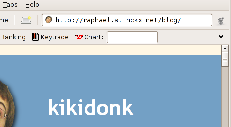
This is a nice trick i didn’t know about. If you ever wanted to have a monospaced font for your location entry in epiphany (it works with galeon too), because monospace is nice, and easier to correct, and you can spot errors, here is how:

Put this in a file called ~/.gnome2/epiphanyrc:
style "mono" { font_name = "Bitstream Vera Sans Mono" }
widget_class "*.EphyLocationEntry.*" style "mono"
You can of course tweak the font settings if you want, say, Comic Sans MS 🙂
Source: http://galeon.sourceforge.net/Main/MonospacedLocationEntry
Comments
6 responses to “Epiphany URL entry in monospace”
Wow, that’s nice. Thanks for the tip. Loving deskbar by the way.
If you want to do the same thing for Firefox :
edit the file ~/.mozilla/firefox/*.default/chrome/userChrome.css and add this :
#urlbar
{
font-family: monospace !important;
}
http://www.geckozone.org/forum/viewtopic.php?t=28965 (French)
[…] Quelle: raphael.slinckx.net Firefox: Die Datei ~/.mozilla/firefox/*.default/chrome/userChrome.css öffnen und folgendes eintragen. #urlbar { font-family: monospace !important; } […]
This is great.
One suggestion: it would be nice if the dropdown below it were in the same font. It’s a little odd to have the location bar monospaced but the dropdown proportional.
Excellent! I don’t know why all URL bars don’t do this. It’s fine for “File” to use tiny letters, because you only have to hit anywhere on the word (or near it), but for editing, you need bigger/wider letters.
Because while this would be nice to have, there’s no way I’m going to remember this when I get home tonight.
*sigh* you forgot the reference to http://galeon.sourceforge.net/Main/MonospacedLocationEntry where we have had that tip for ages 🙂